
Mobile design is no longer just a “nice to have.” For many businesses, the mobile version of a website is the first experience a customer has with the brand. It is also the version search engines rely on most heavily when understanding, indexing, and ranking a site. That means a poor mobile experience can affect more than conversions; it can also limit organic visibility.
Good mobile design is not only about making a desktop website fit onto a smaller screen. It is about creating a fast, clear, accessible, and easy-to-use experience for people who are browsing on the move, often with limited time and attention. A mobile-friendly website should help users find information quickly, complete actions easily, and feel confident that they are in the right place.
Below are some of the most important tips for improving mobile website design so the user interface feels polished, trustworthy, and search-friendly.

1. Design for mobile first, not mobile last
A common mistake is designing the desktop version first and then squeezing it down for mobile. This often leads to cramped layouts, hidden content, awkward menus, and buttons that are difficult to tap.
A better approach is to start with the mobile experience. Ask what a visitor needs most when they land on the page. What is the main action? What information must be visible immediately? What can be simplified, grouped, or moved lower down the page?
Mobile-first design forces you to prioritise. It helps remove clutter and focus the page around the user’s goal, whether that is making an enquiry, reading an article, booking a service, buying a product, or finding contact details.
2. Keep the same important content on mobile and desktop
Mobile design should be simpler, but it should not be weaker. If important content appears on desktop but is missing from mobile, search engines and users may get an incomplete version of the page.
Instead of removing useful content, restructure it. Use accordions, tabs, short sections, jump links, and clear headings to make longer content easier to scan on a smaller screen. The goal is to keep the page complete while making it feel lighter and easier to navigate.
This is especially important for service pages, product pages, location pages, and informational articles. If the desktop page explains your offer clearly but the mobile page only shows a short summary, the mobile version may not provide enough value.

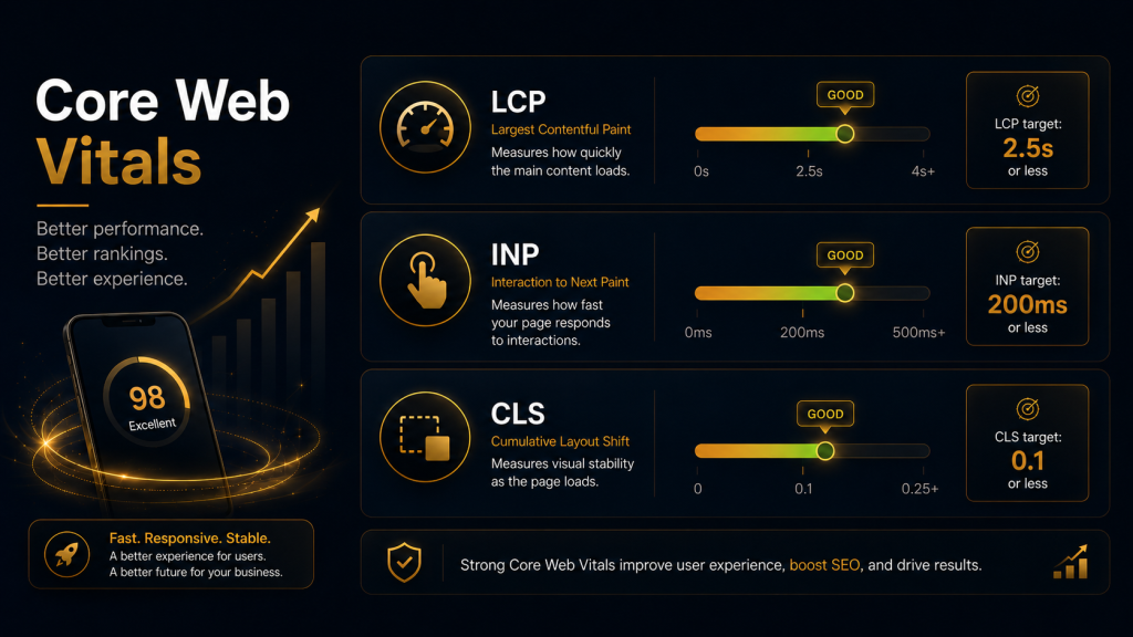
3. Improve Core Web Vitals
Speed and responsiveness are central to good mobile design. A page may look attractive, but if it loads slowly, freezes when tapped, or shifts around while loading, users will quickly lose trust.
Focus on three Core Web Vitals:
- Largest Contentful Paint measures how quickly the main page content loads. Aim for the key content to appear quickly, especially the hero section, main heading, and primary image.
- Interaction to Next Paint measures how responsive the page feels after a user taps, clicks, or types. Buttons, menus, filters, and forms should respond quickly.
- Cumulative Layout Shift measures visual stability. Avoid layouts where images, ads, banners, or buttons jump around after the page starts loading.
Practical improvements include compressing images, using modern image formats, reducing unnecessary scripts, limiting heavy animations, improving hosting performance, and loading only what is needed first.
4. Make navigation simple and obvious
Mobile users should not have to work hard to move around your site. Menus should be short, clear, and easy to open. Avoid burying important pages behind too many taps.
For most websites, the mobile navigation should include the highest-value pages only: services, products, pricing, about, contact, locations, or key resources. If you have a large site, use categories and search to help users find what they need quickly.
Sticky navigation can be useful, but it should not take over the screen. A sticky header, call button, booking button, or basket icon can help conversions, as long as it does not block the main content.
5. Use large, tappable buttons
Mobile users interact with thumbs and fingers, not mouse pointers. Buttons, links, filters, menu items, and form fields need enough space around them to prevent accidental taps.
Primary calls to action should be visually clear and placed where users naturally need them. Examples include “Book a consultation,” “Get a quote,” “Call now,” “Add to basket,” or “View pricing.”
Avoid using vague button text such as “Click here.” Be specific. A clear button tells the user exactly what will happen next, which improves confidence and usability.
6. Make text easy to read
Small text is one of the fastest ways to make a mobile site feel outdated. Users should not need to pinch, zoom, or rotate their phones to read your content.
Use readable font sizes, strong contrast, short paragraphs, and enough spacing between sections. Break up long pages with descriptive subheadings, bullet points, icons, images, and summary boxes.
Good mobile content should be scannable. Many users will skim before deciding whether to read properly, so headings need to communicate value on their own.
7. Avoid intrusive pop-ups and clutter
Pop-ups, cookie banners, newsletter forms, live chat widgets, ads, and promotional bars can quickly overwhelm a mobile screen. While these elements may serve a business goal, they can damage the user experience if they block content or make the page difficult to use.
Use pop-ups carefully. Avoid covering the main content as soon as someone lands on the page. Make close buttons easy to find and tap. Keep banners small, and do not stack too many overlays at once.
A good mobile interface gives users control. It should guide them toward useful actions without interrupting them.
8. Optimise images for mobile
Images can make a mobile page more engaging, but they are also one of the biggest causes of slow loading. Use high-quality images, but serve them at the right size for mobile screens.
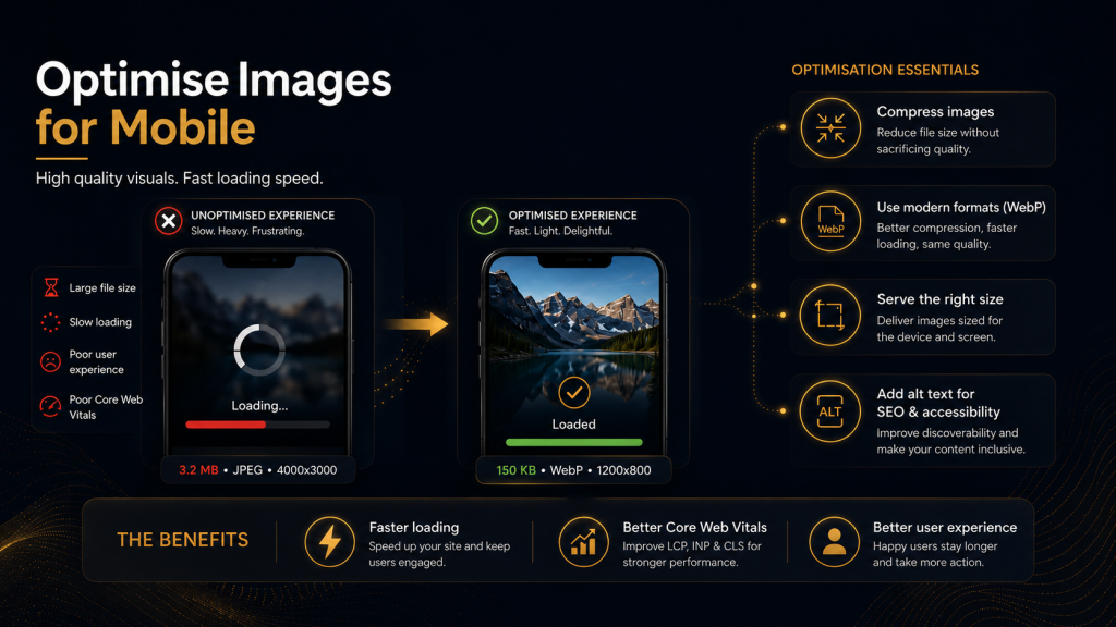
Compress images before uploading them. Use descriptive file names and alt text where appropriate. Avoid using images that contain important text, because they can be hard to read on small screens and less accessible.
Hero images should support the message, not delay it. If a large image slows down the most important content, consider simplifying the design or using a lighter visual treatment.
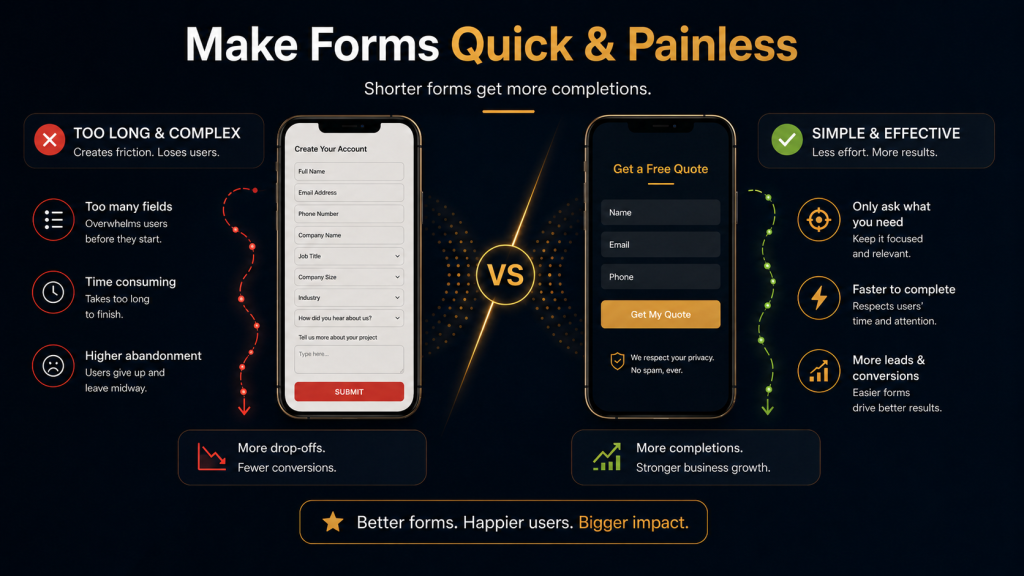
9. Make forms quick and painless
Forms are often where mobile conversions succeed or fail. Long, complicated forms can create friction, especially on smaller screens.
Ask only for the information you genuinely need. Use the correct input types for phone numbers, email addresses, dates, and addresses so the right keyboard appears. Group related fields together, show clear error messages, and avoid making users re-enter information unnecessarily.
For lead generation pages, a shorter form can often perform better. If you need more detail, collect it later after the first enquiry.
10. Build trust quickly
Mobile users make fast judgements. A clean layout, clear branding, professional imagery, customer reviews, security signals, contact details, and transparent pricing can all help reassure visitors.
Trust signals should be visible near key decision points. For example, place reviews near enquiry buttons, delivery information near product purchase buttons, and accreditations near service descriptions.
A mobile site that looks credible and feels easy to use is more likely to keep visitors engaged.
11. Make key information easy to find
Think about the most common questions a mobile visitor has. They may want to know what you offer, where you are based, how much it costs, whether you are trustworthy, how to contact you, and what happens next.
Do not hide this information. Use clear headings, concise copy, and visible calls to action. For local businesses, make phone numbers, addresses, opening hours, and directions easy to access.
A good mobile page should answer the user’s immediate questions without forcing them to dig.
12. Test the site on real devices
Design tools and desktop previews are useful, but they do not always reflect real mobile behaviour. Test your site on actual phones and tablets. Check different screen sizes, browsers, connection speeds, and operating systems.
Pay attention to simple usability issues: Are buttons easy to tap? Is the menu smooth? Does the page load quickly on mobile data? Are forms easy to complete? Does anything overlap, jump, or block the content?
Regular testing helps catch problems before they affect users, conversions, or search performance.
Final thoughts
Improving mobile design is one of the most practical ways to strengthen both user experience and SEO performance. A strong mobile site loads quickly, displays the same valuable content as desktop, uses clear navigation, avoids intrusive clutter, and makes every key action easy to complete.
The goal is not to chase a perfect score or design trend. The goal is to create a website that feels effortless for real people to use. When visitors can quickly understand your offer, trust your brand, and take action without frustration, your mobile UI is doing its job, and your website is in a much stronger position to perform well in search.